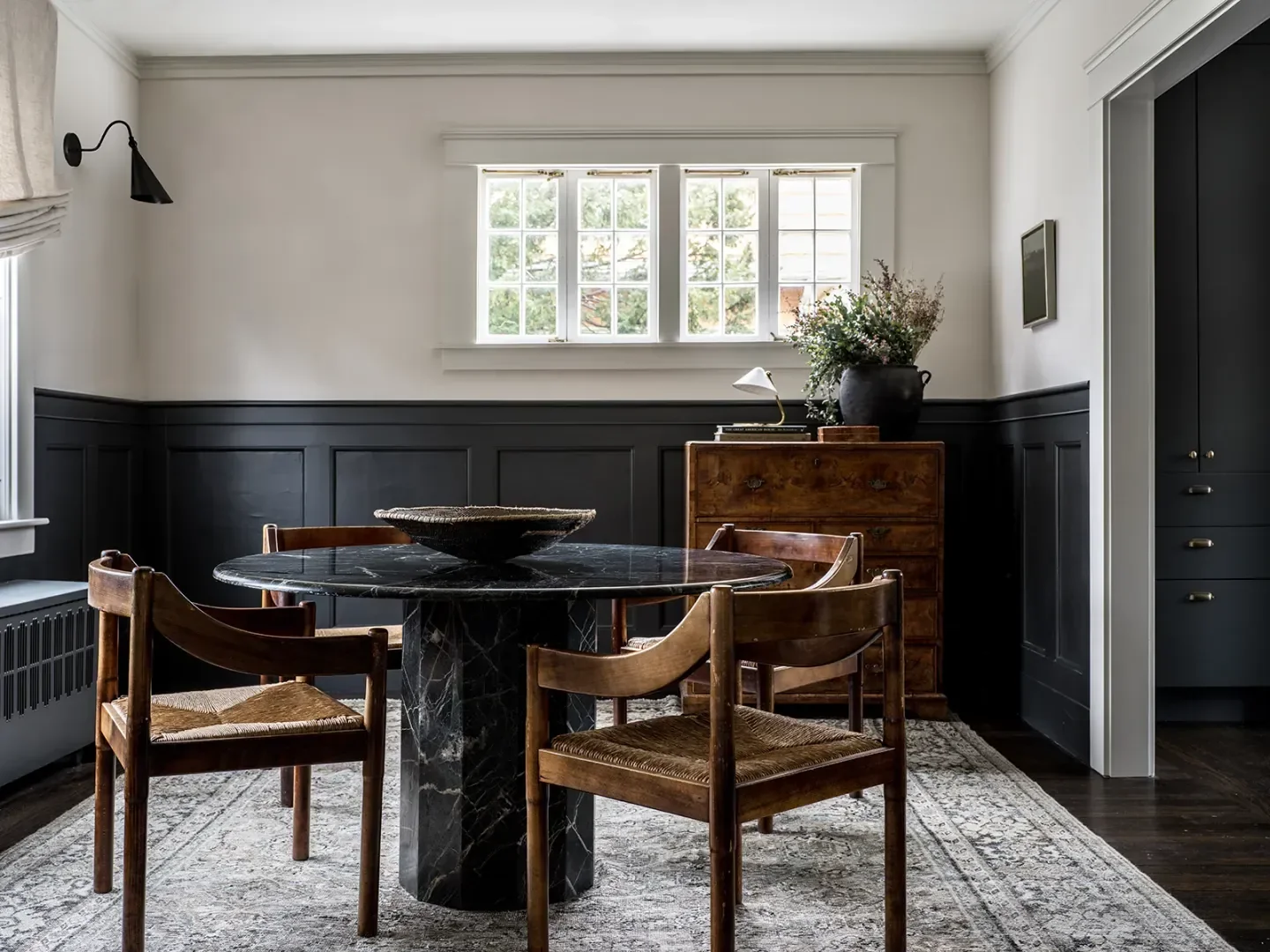
Farrow & Ball's 2025 Paint Collection: Introducing Scallop and the Next Essential Neutral for Interior Design
We may earn revenue from the products available on this page and participate in affiliate programs.
BySamantha Weiss-Hills
PublishedFeb 4, 2025 2:10 AM EST
Sign Up for Domino's Newsletter
Sign Up for Domino's Newsletter
By signing up, you confirm you are 16+, will receive newsletters and promotional content and agree to ourTerms of Useand acknowledge the data practices in ourPrivacy Policy. You may unsubscribe at any time.
Farrow & Ball has a distinctive approach to naming its colors in complementary pairs: De Nimes and Selvedge, Cord and String. Now, the brand introduces a companion for cult favorite Dead Salmon. Among the celebrated British paint and wallpaper brand's 2025 release of nine new colors is Scallop. A lighter interpretation of its counterpart, the shade draws inspiration from the subtleties of the shellfish it's named after—from its pale pink hue to its curved edges.
"I think Scallop, as a whole, is such a good neutral," says creative director Charlotte Cosby. "I love it for its versatility and the fact that… it has that sort of pearlescent feel to it. It's not as pink as Setting Plaster, and not as gray as Jitney. It works for living." In other words, it's positioned to become a defining shade in contemporary interiors.
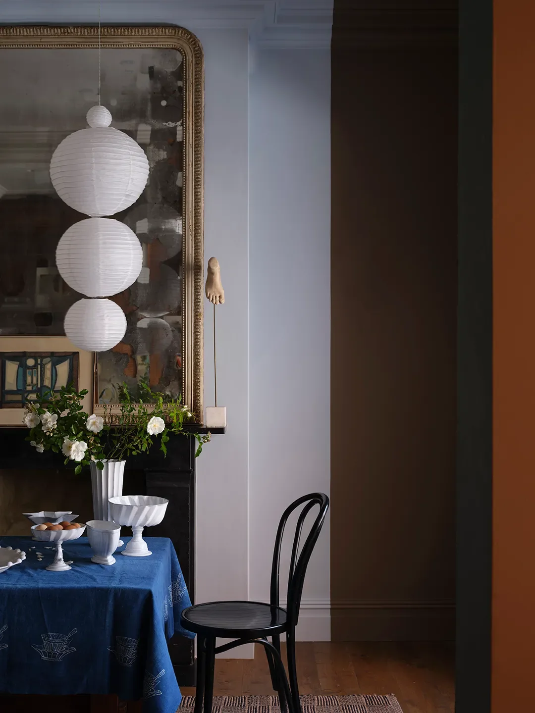
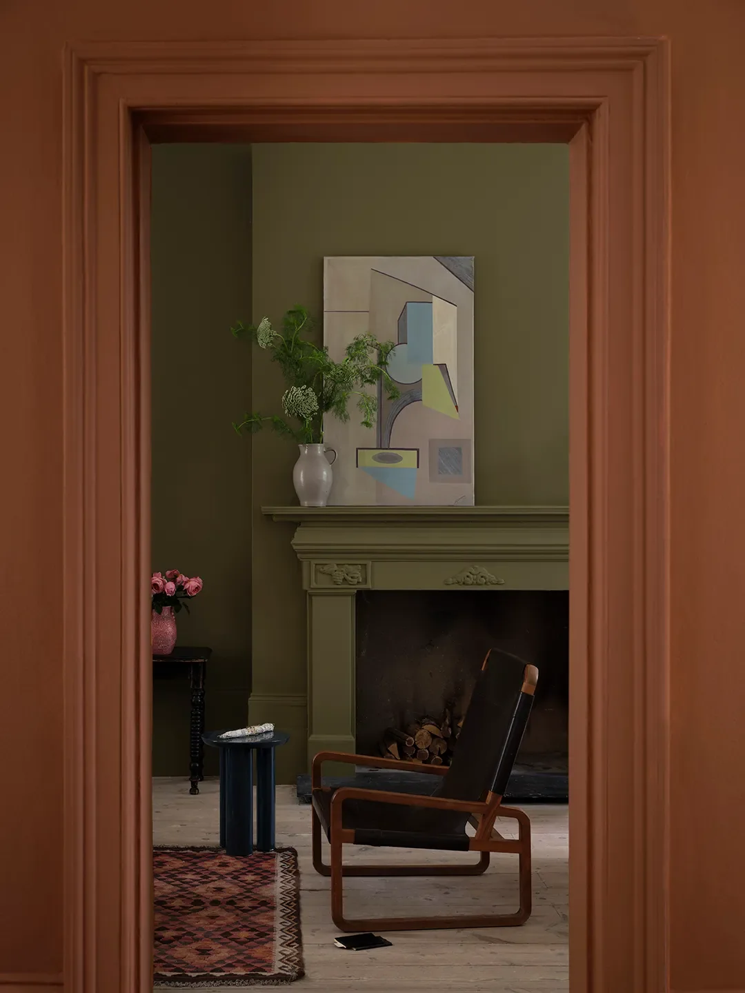
Scallop takes its cue from the natural world like many Farrow & Ball shades, but color curator Joa Studholme notes that several of this year's introductions were sparked by ordinary household objects. A tarnished candle snuffer, the humble apron, a garden tool, and a classic dusting cloth have inspired smoky gray-green, rich terracotta, muddy green, and exuberant ochre, respectively. Studholme observes that this set of hues is "all about things which are quite, quite small."
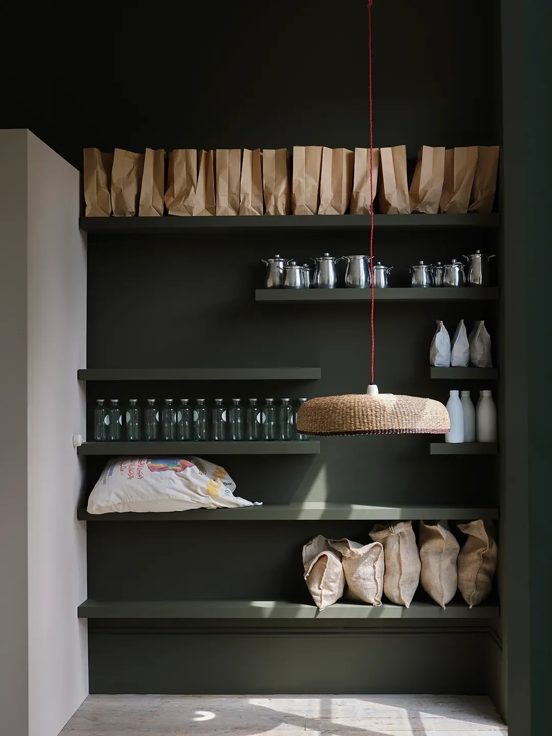
An unexpected quality of this collection is that, while each color was developed to fill a specific gap in the range, they all work together in various combinations. For example, Cosby and Studholme were delighted to see the quince-inspired Marmelo complement archival gem Broccoli Brown and Kakelugn, a light blue that takes its name from the color of Swedish fireplaces. The comforting orange shade also pairs beautifully with Douter, a "love child" of Green Smoke and Inchyra Blue. "It feels like something very familiar," Studholme says of Marmelo, which evokes bountiful shelves of pickles and jams. "It's almost from the world of utility."
And, yes, Scallop brings out the best in a number of other Farrow & Ball hues, like Reduced Green, Duster, and Etruscan Red, one of three archival colors included in this group. Along with Broccoli Brown, the trio is rounded out with the strong, energetic Sap Green.
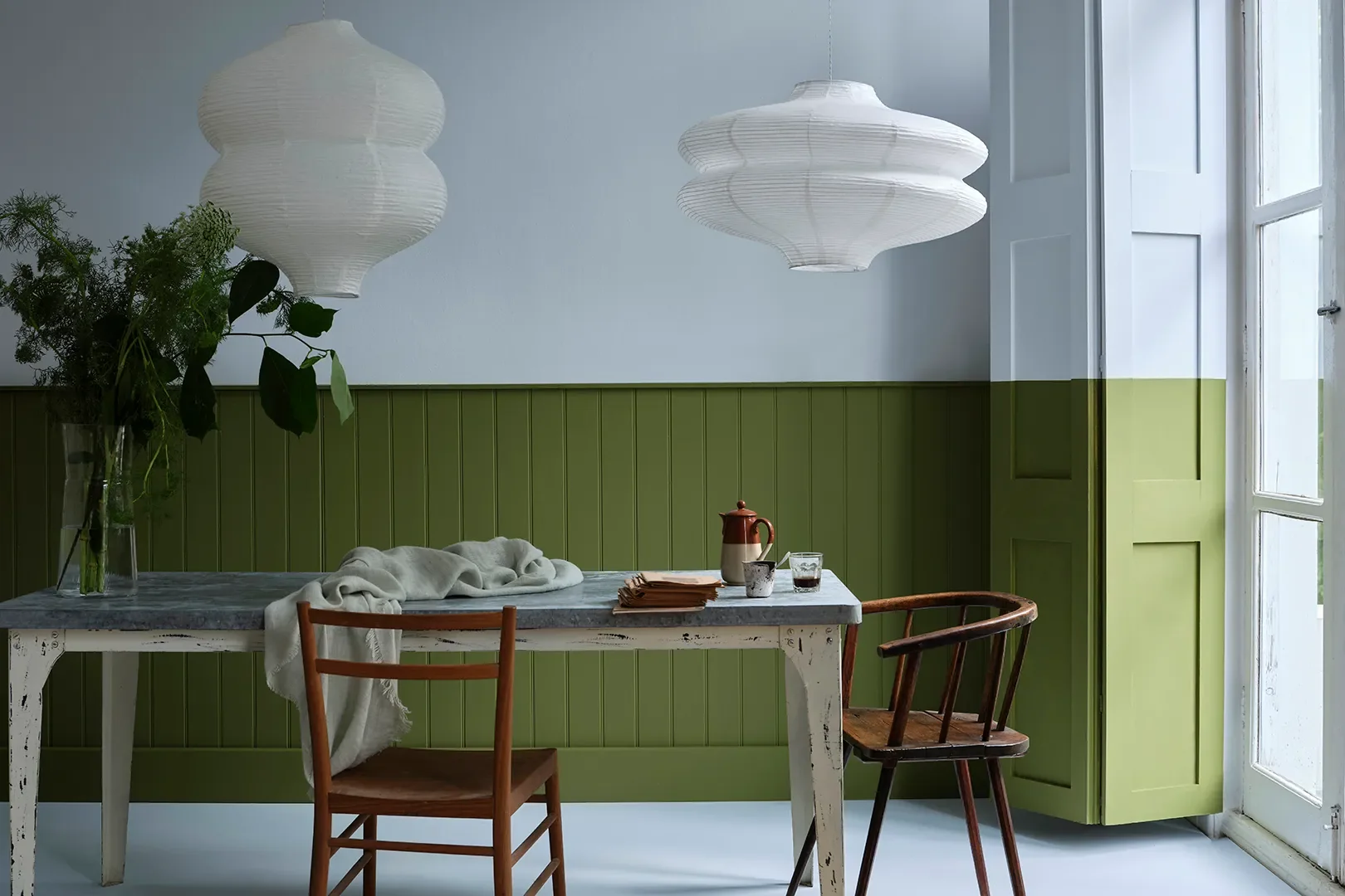
"We felt that they really complemented this palette [and] that people wanted them now," Studholme observes. "We sat down to make them and thought, This is ridiculous, because actually we have these."
Cosby and Studholme offer a range of professional recommendations for putting the palette to use. For exteriors, they both point to Reduced Green and Dibber as the go-to selections. Reduced Green also excels on kitchen cabinets and in mudroom settings. Douter would work well in intimate spaces like a study or powder room. "[Reduced Green and Douter] look like they've been there forever," Studholme notes. Sizing, a crisp light blue reminiscent of the starch it's named after, is an apt choice for laundry rooms; Cosby notes you can practically sense its clean, fresh character. For color drenching, the duo recommend Douter again, plus Naperon, Duster, and Marmelo.
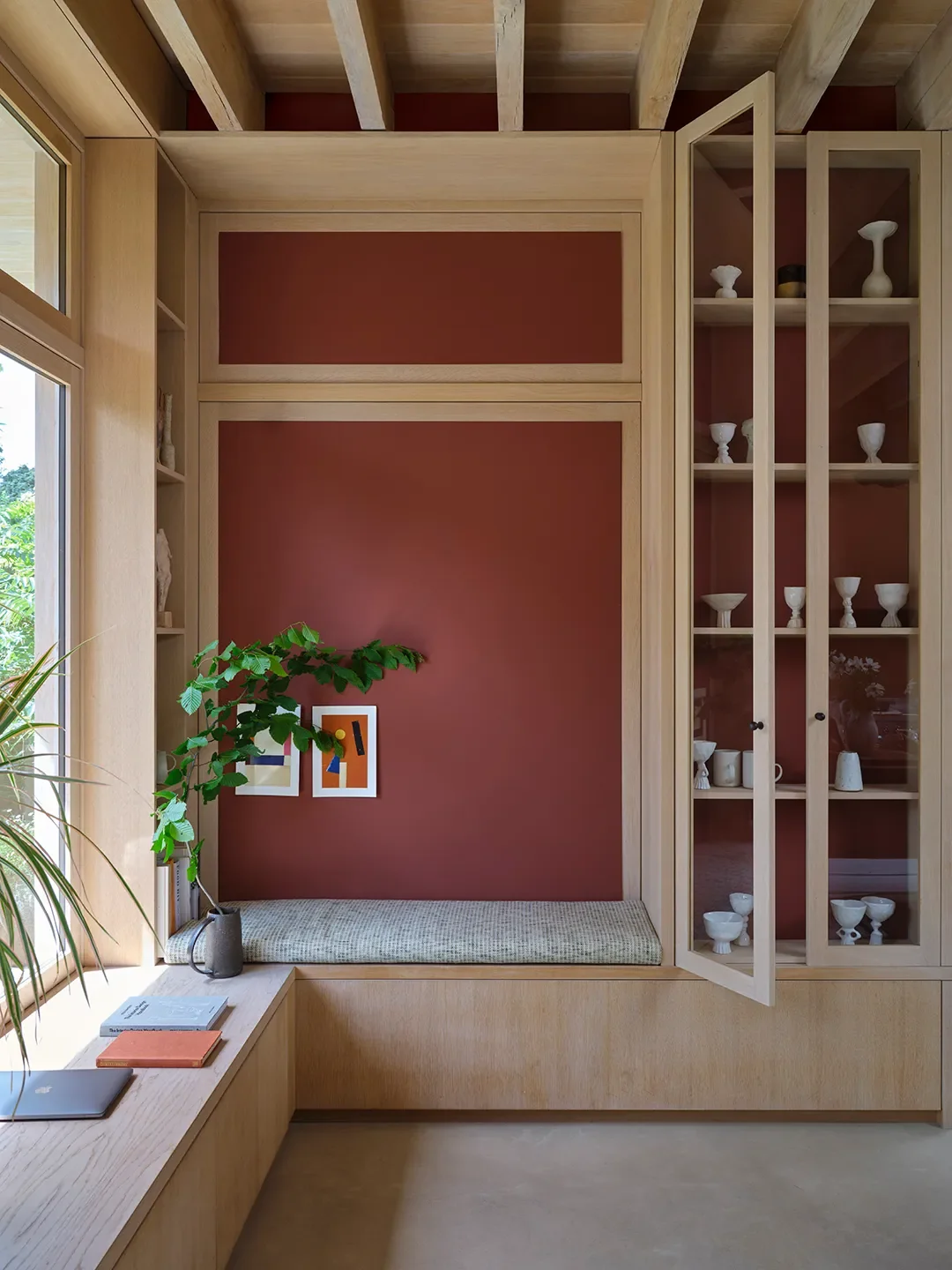
A favorite combination of Studholme's featuring Scallop? "I absolutely love if you do the bottom half of the wall in Etruscan Red and the top in Scallop. Very easy stuff, but it's beautiful." A clear testament to its future as the next essential neutral.
All New Farrow & Ball Paint Colors for 2025
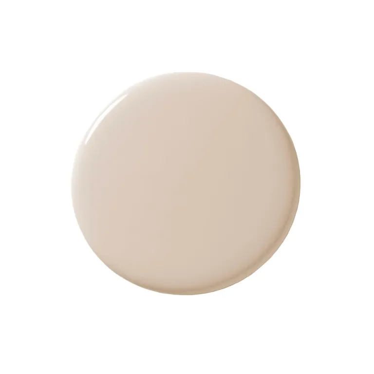
Scallop
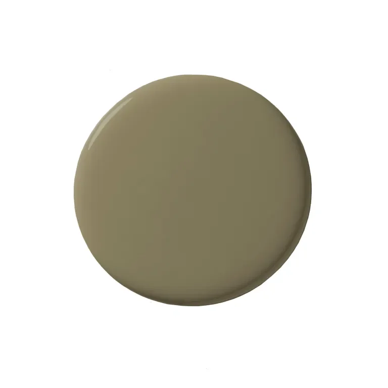
Dibber
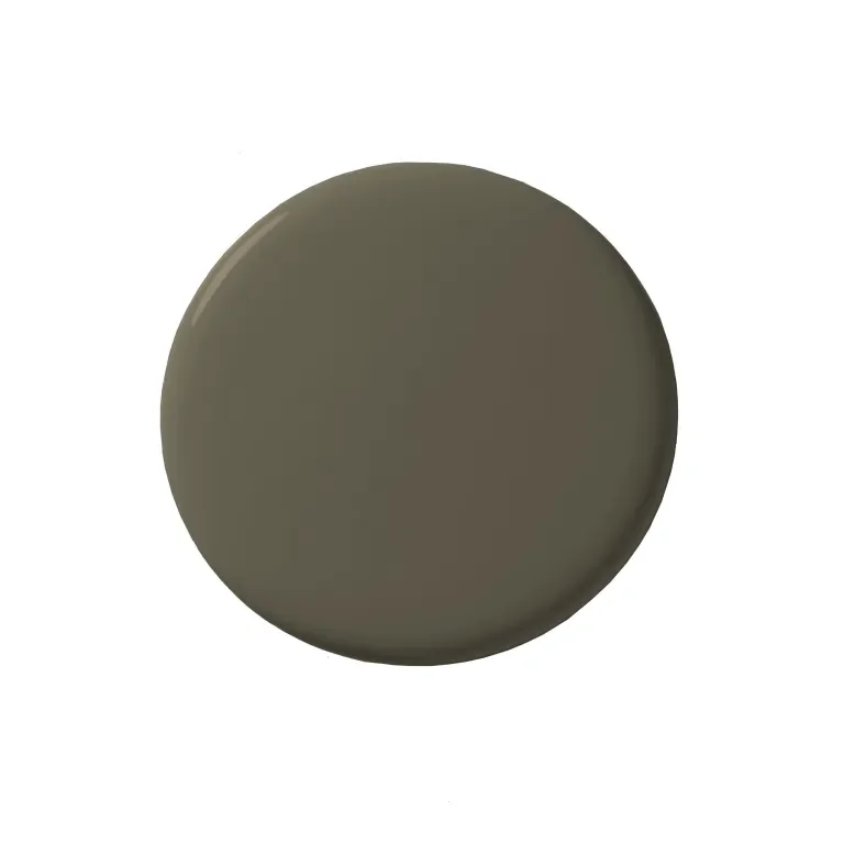
Reduced Green
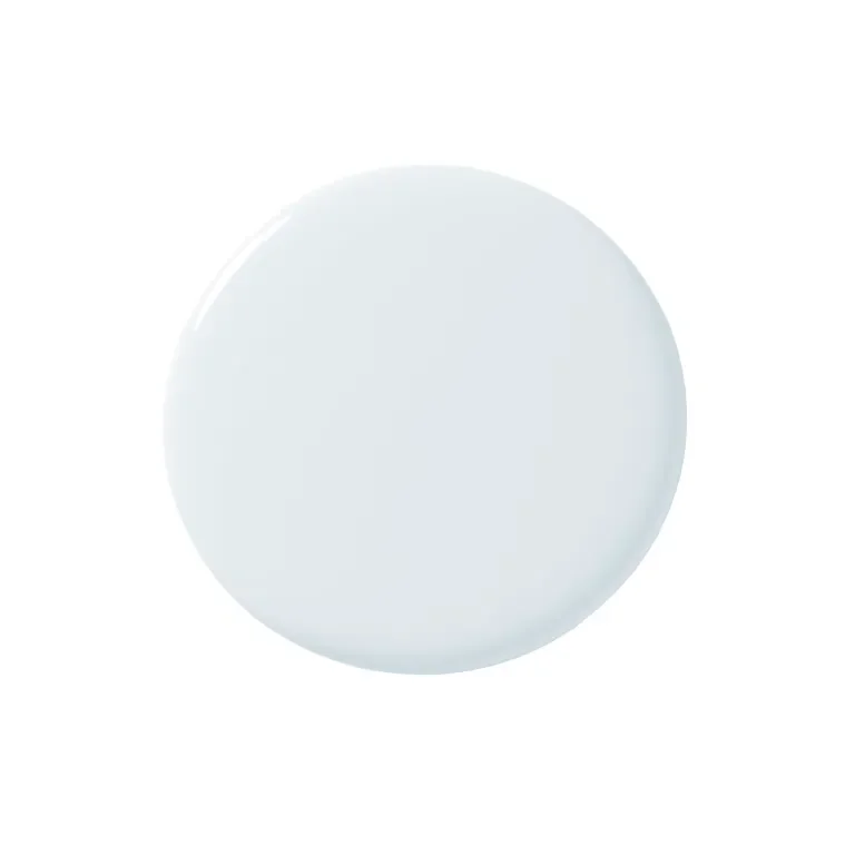
Sizing
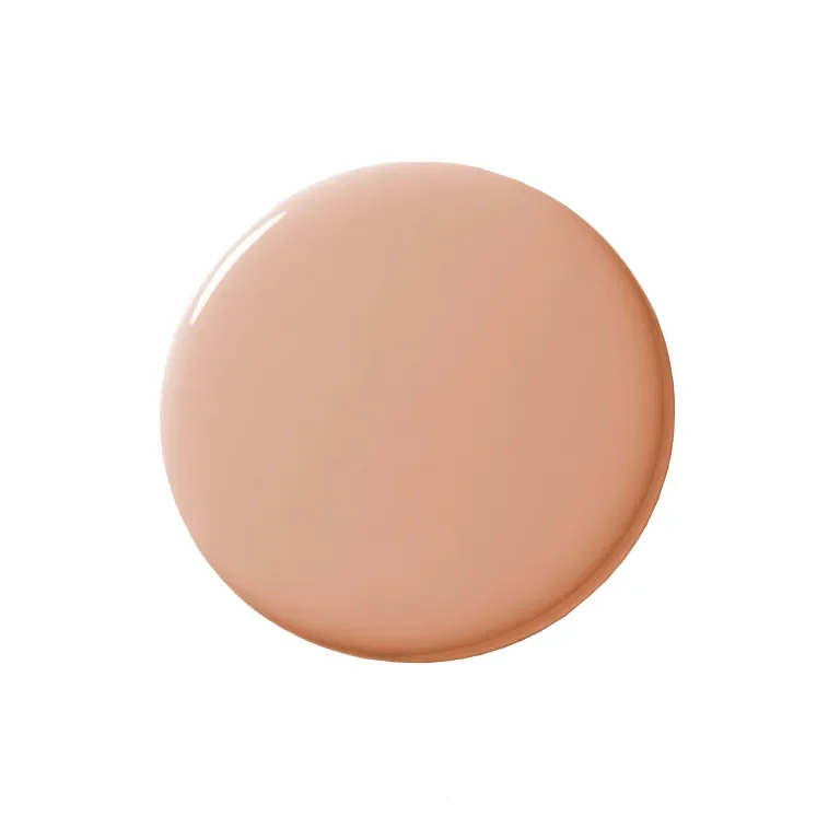
Naperon
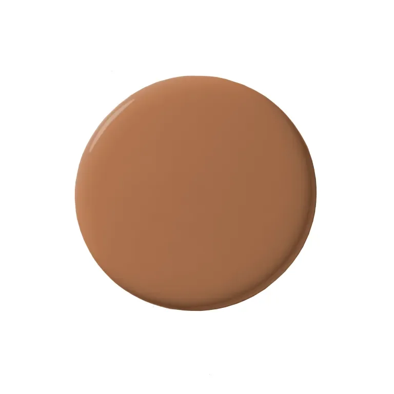
Marmelo
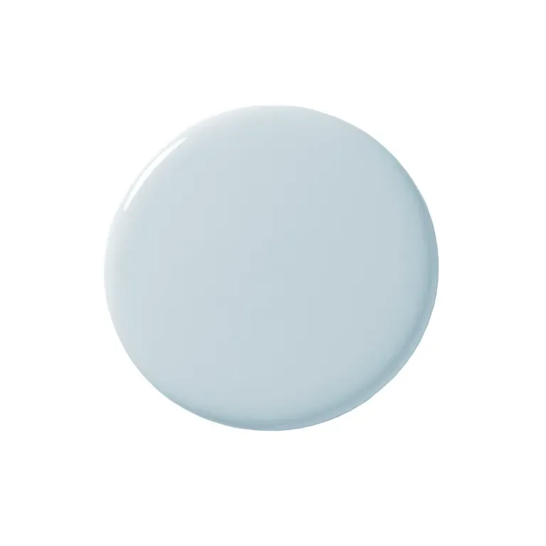
Kakelugn
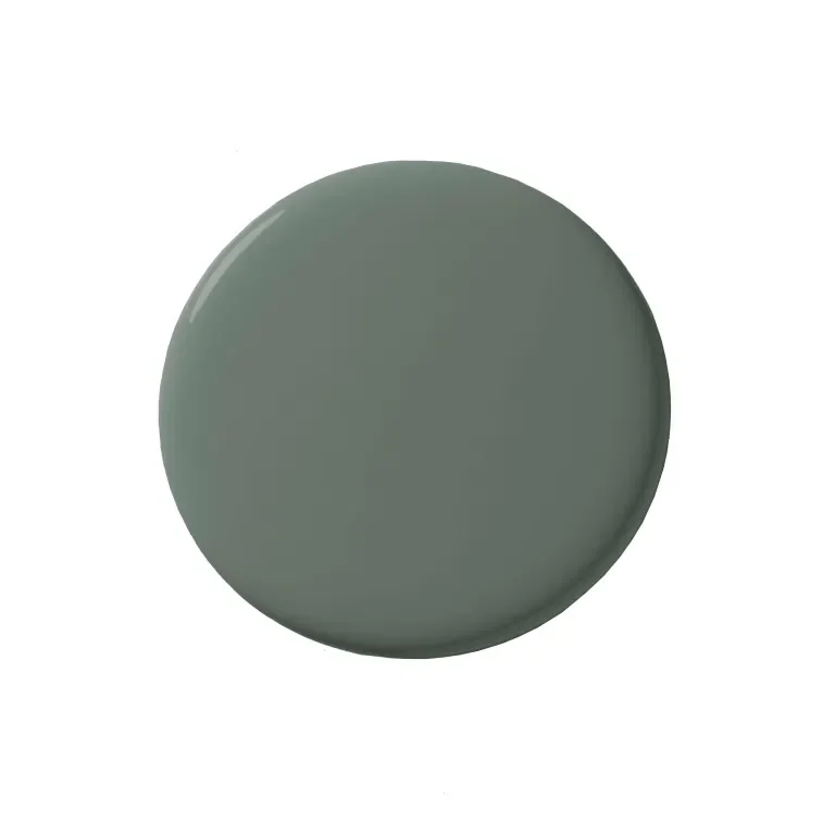
Douter
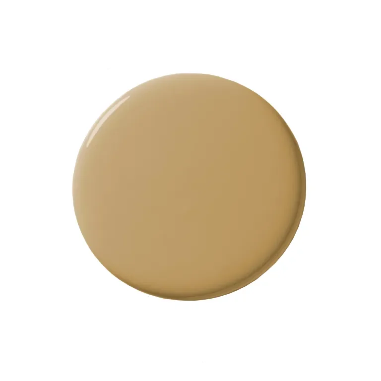
Duster
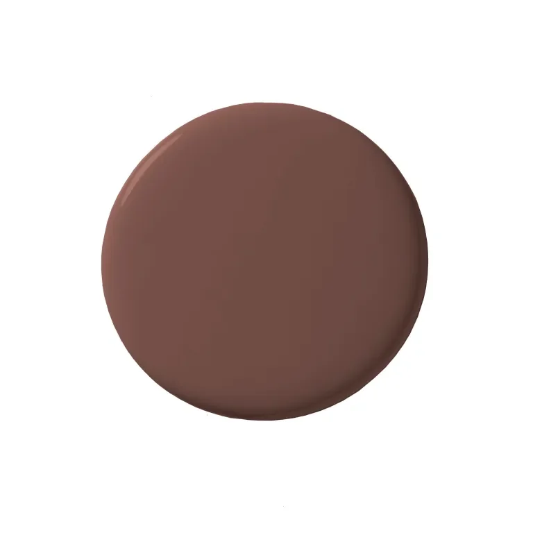
Etruscan Red
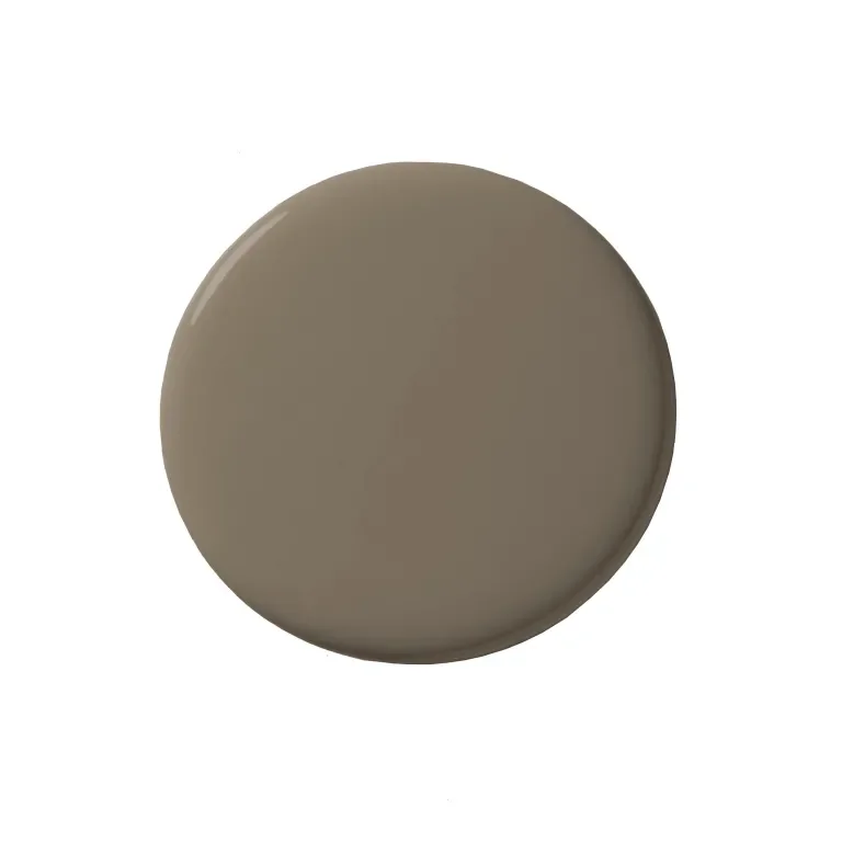
Broccoli Brown
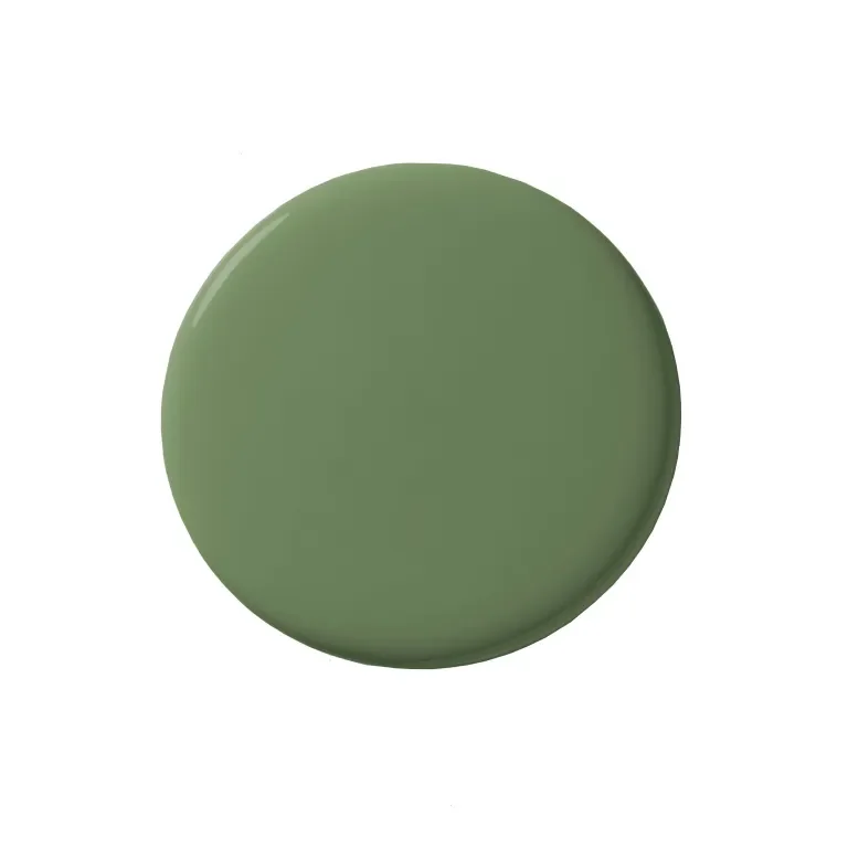
Sap Green

Samantha Weiss-Hills
Managing Editor
Samantha Weiss-Hills is the managing editor for Domino. She edits and writes home tours and features, and she's the friend who everyone texts for glassware, sofa, and sheet recommendations. She lives in Brooklyn with her husband, Alex, and their beagle-corgi, Elsa.
Learn more about Domino.comEditorial Standards